

Go  | New | Find | Notify | Tools | Reply | |
| Guild Wars | Login/Join |
Member |
This game looks like so much fun lmao! im buying ASAP! | |||
|
Phil |
yeah I wasn't crazy about it in the world preview event, but now I am lovin it. Helps with all the lowcal homies playing. Now we just need mid and unter in here too | |||
|
| Phil |
Ok we have a buttload of option for capes. I think we need to vote this down to a few. Or maybe vote on aspects we want and go from there. I say we need unusual colors. I made plenty of good looking capes, but with too comon of colors and designs. We need something that sticks out and is rarer. So I vote we use the pinkish lowcal color or maybe some kind of off blue (perrywinkle or somethin) to set ourselves apart.  also did you guys see http://guildwars.gameamp.com/game_map/game_map/125.php? 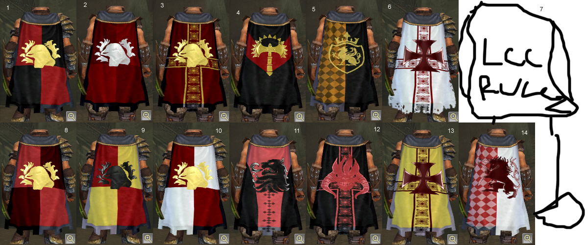 Cpaes.jpg (615 Kb, 132 downloads) Cpaes.jpg (615 Kb, 132 downloads) | |||
|
| Peregrine |
How goes it fellas? I am new here to the forums and thought i just say hi. I am in the Guild wars guild for Low Cal. and someone mentioned a voting on a cape. Lets do it. | |||
|
| Phil |
well I would vote #7 but I don't think it can be done | |||
|
Magistrate |
I'll go with whatever you guys pick. | |||
|
Member |
Here is a couple more to add to the list we dont necessarily have to keep the castle shape but if we are goingto get a cape lets decide onan emblem. The emblem on these capes an bechanged as well. These are color possiblilities. 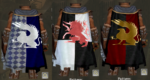 Cape_Presentation_3_final.bmp (360 Kb, 26 downloads) Cape_Presentation_3_final.bmp (360 Kb, 26 downloads) | |||
|
| Phil |
Ok we now have too many capes! Lets narrow this lot down. I say we vote on aspects that the club wants, then make capes with those aspects, then vote on which cape. Sound good? 1. Cape shape -regular shape -detial pattern/design 1. Cape shape -regular shape -detial pattern/design 2. Cape Colors -Primary -detail 3.Emblem c -color -emblem 2. Cape Colors -Primary -detail 3.Emblem c -color -emblem | |||
|
| Phil |
My vote 1. Cape shape -Castle or pointed like the last 3 on my other capes. -I think the 4 way shield look, or the kind of cross pattern that I used on a few 2. Cape Colors -Lowcal pinkish -black or gold 3.Emblem -black/gold/lowcal pinkish (what fits with the rest of the cape) -I like the spikey helm, the unicorn, lion, double headed griffin, sword and weed tangle | |||
|
Member |
In all honesty I don't even want a cape lol. I think it will clash with my outfit, and now I'm gonna have to buy new clothes hehe. I wish there was invisible dye so I could have a clear cape or at least translucent. I chose a female Avatar so I could look at her buttocks!! Don't hide my Necro Fine Ass lol! Weeeeee. PS I still have to get a converter art prog so I don't post .bmp pictures.... but I got a screen the other night of a double gold drop!! Once I make a .jpeg out of it I will share  . .Yeah I found one area (just outside Kryta) where I ALWAYS find at least 3 purple and 1 or 2 gold items per run. It's treasure hunting paradise!!!!! And I vote #7!!!!! | |||
|
| Member |
I like everything my cape number 2 has to offer. Too much pink is dangerous. How about we narrow it down to the favorites of all the capes made so far and have a poll. | |||
|
| Phil |
lol sure whatever. I don't care that much. Kracka, go ahead and get whatever you want. It is turing into a more complicated thing than need be | |||
|
| Phil |
BTW if we are going to I like my #12 | |||
|
| Phil |
vote that is. Going to *vote* | |||
|
Sunshine |
You said to make some capes so I did. Honestly I think all my capes kinda look the same, I didn't do too many LCC colors because, frankly, the orange/grey/white scheme is absolutely ugly outside of our logo and this forum and I'd never wear that as clothing (except on my viva la relativity shirt) let alone put it on my character. It could work I just haven't found the proper scheme and mix to make it work. Turns out I like the black on white thing... Socketboy keeps talking about how every other cape looks like ours and it keeps going through my head... frankly I don't look at other people's capes. They do all look the same, good for them, they all have that same MMORPG mindset and follow identical patterns... but exactly where are options to go nuts and make a truly unique cape? Working with what we have there I can only come up with a few patterns and they all look like everyone else's... you can't have double-emblems, rotated objects, uploaded images or even the ability to move the emblems down just a smidgen. There's a limit and the only way to work with it will result in making a bunch of designs that resemble at least a few other people's because that's just what looks good. You tell me, Socket, if mine looks like everyone else's; I think they look pretty "OK" and I don't recall seeing other people with these... you really only notice others when you TRY and such: when you're making your cape you want to look around and make sure no one else is the same... well I tried not to. So yeah some patterns required little or no changes but they looked OK to me, maybe you'll like my style, I was hoping to make them all kind of like my #7, which involved the detail color in the middle to contrast only where the emblem color blends into the background on its edges (it was hard though since many emblems have this weird fucking glow at the sides that pissed me off, you can see a perfect example in my #9). OK SO HERE'S MINE: 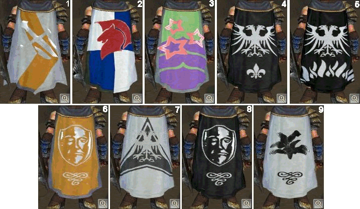 I hate: #1, #6, #9. I like: #5, #7 & #8. I love: #3. The ones I hate I only showed because ... well I made them. #2 I just made because some of your capes reminded me of Red Bull and I thought it would be funny to have Red Bull capes, that'd kick ass. If we had a vote and you all voted #3 I'd be all too happy... that one just kicks ass (hell, it matches Fista's hot necro chick too!) and we need to be a little less serious... how many capes look like that anyway?This message has been edited. Last edited by: Pencil, 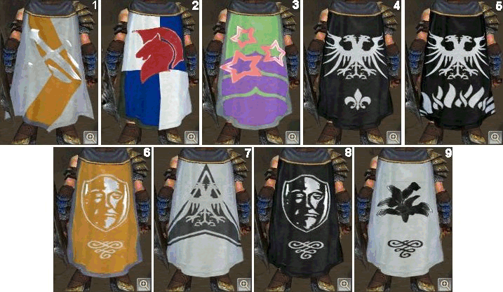 lcccapes.gif (177 Kb, 88 downloads) lcccapes.gif (177 Kb, 88 downloads) | |||
|
| Phil |
I only see 1-5. 4 would be my fav, 3 least fav. I would perfer color though if we are not going to care if our cape looks like anyone elses. | |||
|
| Member |
Hehehehehehhe I have never seen a cape that looks like #3 heheh. Now I wanna vote for that.... but we may have to change our Guild name to LCT Low Caliber Teletubbies. !! wewet! And yes that color scheme would fit my evil Necro quite well lol, but I must admit it does bring to mind powdered wigs n such lol. | |||
|
| Sunshine |
Reuploaded. I wish you liked #3  . .No renaming! Clubs can be cute too ! | |||
|
| Phil |
lol #3 is just a bit too far off for me... Mano! You were asking what you needed to save for your ranger's armor? http://www.gwonline.net/page.php?p=75 | |||
|
| Phil |
| |||
|
| Powered by Social Strata | Page 1 2 3 4 5 6 7 8 ... 12 |
 | Please Wait. Your request is being processed... |
|
© Low Caliber Club 2002-4